Wednesday, May 29, 2013

SEO Is A Necessity, Content Creation Is A Strategy And Social Media Is The Channel


SEO in 2013 is about quality web presence, thought leadership, popularity, user generated content, company blogs , social media, guest blogging and every foot print on the web which helps you in implementing this online. SEO in 2013 has evolved to such a stage that it is a necessity and is finely woven into each and every online activity which helps you determine your search and web presence.

Social media has recently been the most rapidly growing channel which helps you get the much needed outreach whether it is B2C or B2B business.

According to a recent eMarketer survey the statistics are as follows:

social media platforms 2013


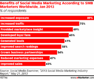
social media benefits 2013

As we can see above, FaceBook and Blogging (Content Creation) are the 2 main social media platforms and the major benefits accruing from these platforms are increased exposure and increased traffic.

No brand can afford to neglect the social media presence as the benefits which can get accrued via social media are multifold and again are woven into each and every online marketing activity which any brand decides to opt for.

SEO is a necessity, social media is the channel and the content creation strategy determines your online brand identity.

As we can see above the benefits from social media mentioned above are interdependent and one benefit leads to another.

Social Media presence helps you to get increased exposure , this increased exposure increases the inbound traffic, the increased traffic and content on your site helps develop loyal fans which spreads a good WOM (Word Of Mouth) and generates leads, increase business partnerships and thereby increase sales. All the footprints and social signals created in the process give a boost to the SEO which in turn again generates all these benefits via search presence.

In theory this sounds very simple and logical but when put in practice a lot of effort, insight and an eye for defined goals is needed else all the time, money and effort can just go down the drain.

Saturday, May 18, 2013

What Is Responsive Web Design And Why We Should Opt For It?


What Is Responsive Web Design?

Responsive web design (RWD) is a web design approach aimed at crafting sites to provide an optimal viewing experience across a wide range of devices -from desktop computer monitors, tablets to mobile phones. Responsive web design is the latest web design trend of 2013 and becoming a standard practice for the web design industry .


A website developed using Responsive Web Design adapts the design of the page depending on the device it is going to be viewed. Hence, RWD uses fluid proportion based grids, flexible images and CSS3 media queries.

  • The fluid grid concept calls for page element sizing to be in relative units like percentages, rather than absolute units like pixels or points. 
  • Flexible images are also sized in relative units, so as to prevent them from displaying outside their containing element. 
  • Media queries allow the page to use different CSS style rules based on characteristics of the device the site is being displayed on, most commonly the width of the browser. 

Why Is Responsive Web Design Becoming The Hottest Web Design Trend Of 2013 ?

The Forrester Research Mobile Advertising Forecast, 2013 To 2018 (US) predicts that mobile ad spend (smartphones plus tablets) will represent more than 29% of the total online ad spend in the US by 2018.

According to eMarketer the devices used to access the internet by US consumers from July 2011 to Jan 2013 were as follows:


As you can see the desktops use was reduced 3 %, the use of tablets increased by 6%, and the use of mobile phones increased by 10.5% which means an over all increase by 16.5% for hand held devices.


The time spent on Mobile Internet by US Mobile Users in the first quarter of 2013 by activity is as follows: 


As we can see that email and social networking are at the top which directly is related to business hence as the smart phones become smarter and people become more dependent on them no company website can ignore responsive design in the coming future.

If the use of various devices by the user is increasing on a regular basis and the choice of the device depends on the place the user is surfing from, then surely the website has to get adapted to the device and display the right content according to the size of the display unit of the device. 


According to Jeffrey Veen (The Vice President of products for Adobe): 

“Day by day, the number of devices, platforms, and browsers that need to work with your site grows. Responsive web design represents a fundamental shift in how we’ll build websites for the decade to come.”


Earlier to assure a good browsing experience the web designers had to keep in mind the browser and accordingly write code to assure the correct display for the users. Now it is about having one site for screens of various devices used commonly.

According to - Jeremy Keith :

“Stop Thinking in Pages. Start Thinking in Systems”.


Jeremy Keith in the video on  http://vimeo.com/50745034   explains some of the following points and much more:
  • Responsive Web Design requires the rewiring of our brains to think about designing for the web just as we started thinking differently when we started using CSS and separated the content from the design. 
  • Responsive design is not about taking your existing device specific design and shrinking it for smaller devices. One needs to start from scratch. 
  • We need to think about content outwards rather than about canvas inwards as on the web we don’t know the canvas. Content over here is not necessarily copy , text or words but can be anything from a task or a user flow like the check out function on a shopping site or a post to a forum page, etc. are all fundamental units of content. 
  • Prior to Responsive web design visual designers sort of dictated the system requirements to the user like the browser used, internet speed specifications , javascript capabilities, etc. but responsive design is more like a dialogue between the designer and the user and ensures that the website meets the user wherever he is. 
  • If you want to be future friendly one of the best techniques is to be backwards compatible. 
  • He ends the presentation with a constructive thought that responsive design is not about mobile but about the web. 

Responsive Web Design And SEO: Does Google Support RWD?

Yes, Google supports Responsive Web Design

1. Google supports sites which use same URLs for different device specific layouts i.e the HTML is the same for every device but only the CSS changes as per the display required for the specific device.

2. Or, if the URLs remain the same but the HTML and the CSS change as per the user agent.

3. Or, have separate sites for mobile and web.

4. Be sure not to block the crawling of any Googlebot (i.e for the web or mobile) for the page assets (CSS, javascript, and images) using robots.txt or otherwise. Being able to access these external files fully will help Google algorithms detect your site's responsive web design configuration and treat it appropriately.

5. Googlebot and Googlebot-Mobile should should automatically be able to detect this setup while crawling the page assets like HTML, CSS, Javascript.

6. The Vary HTTP header helps Googlebot discover your mobile-optimized content faster, as a valid Vary HTTP header is one of the signals Google uses to crawl URLs that serve mobile-optimized content.

7. If the responsive design servers use different URLs for desktops and mobiles then on the desktop page, add a special link rel="alternate" tag pointing to the corresponding mobile URL. This helps Googlebot discover the location of your site's mobile pages.On the mobile page, add a link rel="canonical" tag pointing to the corresponding desktop URL.

8. This rel="canonical" tag on the mobile URL pointing to the desktop page is required to avoid duplicate content issues which have an adverse effect on the SEO.

9. Google supports the rel="alternate" annotation for the desktop pages in Sitemaps as follows but the required rel="canonical" tag on the mobile URL should still be added to the mobile page's HTML.


<?xml version="1.0" encoding="UTF-8"?>

<urlset xmlns="http://www.sitemaps.org/schemas/sitemap/0.9"

  xmlns:xhtml="http://www.w3.org/1999/xhtml">

<url>

<loc>http://www.example.com/page-1/</loc>

<xhtml:link

    rel="alternate"

    media="only screen and (max-width: 640px)"

    href="http://m.example.com/page-1" />

</url>

</urlset>

Is HTML5 The Right Choice For Responsive Web Design?


Matt Groener, Intel Developer Zone development team manager says:

  • "HTML5 is the backbone of the new and interactive features of responsive Web design,"
  • "Developing in HTML5 benefits all of the ecosystems because you get to market faster,"
  • "You don't create an iOS app and then, when time permits, bring it to Android or Windows. You can do it in any or all ecosystems at exactly the same time."
  • “It will only get better for developers as HTML5 matures, becomes faster and adds more features that put it on par with native application development. The future is more responsive rather than less responsive. I don’t see that ever changing.”


Don’t you think it is high time to opt for Responsive Web Design and let your virtual presence flow to fit any device the user has?

What do you say?


Enhanced by Zemanta

Labels: , , , ,

Thursday, May 16, 2013

Company Logos In Google SERPs using " Organization Mark Up"


Google launched the support for organization mark up as per schema.org . This mark up is for organization logos which is a way to connect a site with its iconic image.

For example, a business whose homepage is www.example.com can add the following markup using visible on-page elements on their homepage:

<div itemscope itemtype="http://schema.org/Organization">

<a itemprop="url" href="http://www.example.com/">Home</a>

<img itemprop="logo" src="http://www.example.com/logo.png" />

</div>


Markup like this is a strong signal to Google algorithms to show this image in preference over others, for example when we show Knowledge Graph on the right hand side based on users’ queries.

In fact lately I had observed many people adding the rel = “me” tag on static sites and by way of cross-linking their profile to their Google+ page the relevant image was getting displayed in SERPs.
This totally beats the purpose of the authorship mark up because in such cases I usually observed the site owner pics. which were getting displayed. As the publishership mark up did not get the green signal from Google this organization markup will surely help to keep a check on this and help the content to get correlated to the rightful authors which will in turn establish their thought leadership and of course the authority will also get passed on to the organization for which they write.

But the Rich Snippets Tool currently not displaying the logo in the preview although it detects the structured data on the URL tested.


Labels: ,

Wednesday, May 15, 2013

Google I/O 2013 : Just Say “OK Google” To Search Hands Free in Chrome


Amit Singhal presented the future search experience which had a focus on the following 3 aspects of search:


Google I/O 2013


  •  Answer 
  •  Converse 
  •  Anticipate what the user might ask and offer the answers before the user can ask further questions. 


He said, all this is possible due to the Knowledge graph which Google announced last year. Now Knowledge Graph is available in Polish, Turkish, Simplified Chinese and Traditional Chinese languages. 

Google has updated its voice search feature with what it calls a "no-interface" approach for Chrome and Chrome OS.

Singhal revealed that there are now over five hundred and seventy million entities in the Knowledge Graph.

Singhal said, “Last year when we launched the Knowledge Graph, it was a huge advance in search technology. Knowledge graph enabled Google to move beyond keywords and understand real world entities.

The user can ask questions to Google like a friend and Google will answer back. This kind of verbal command is already being used by Google Glass and the command has to start with “OK Google....”

The conversational voice search and hot wording experience is soon coming on chrome and what is different is that Google says you’ll be able to continue the “conversation” to keep searching and it will understand where you are and when you ask how far is the airport from “here” then Google already knows without having you to say name of the place.

View the demo by Johanna Wright - VP Search And Assist Mobile  at Google

Monday, May 13, 2013

Penguin 2.0 And What Is In Store For SEO In The Next Few Months For Google


Penguin 2.0 By Google -  May 2013
Matt Cutts had been announcing on Twitter lately that there soon is going to be a major algorithmic update  and yesterday the WebMaster video by him gave an idea about what to expect out of it in the near future.


Matt Said:
  1. Google is on the verge of launching a new generation of Penguin updates i.e Penguin 2.0 which is more comprehensive than Penguin 1.0 which will go deeper to combat spam. 
  2. If you pay for Ads. Then those ads. should not flow PageRank. There should be a clear and conspicuous disclosure if an Ad. is displayed on the site so people know that it is a paid display.
  3. Search queries that tend to be spammy in nature, such as [pay day loans] or some pornographic related queries, will somewhat be less likely to be a target for Google’s search spam team at the moment but will surely get Google's attention soon.
  4. Google has some nice ideas to deny value to link spam and Google is working on a more sophisticated system for link analysis. 
  5. Google hopes to detect hacked sites better and communicate with webmasters better to help clean up the hacked sites via webmaster tools and many other resources. 
  6. If you have been doing high quality SEO you should not worry about these changes. 
  7. Google is doing a better job now to detect authority in a particular space and will make sure that they rank higher. 
  8. Google is looking for ways to “soften” the impact of the Panda Update for sites which are found in the grey area and have some high degree of quality signals. 
  9. Once you see a cluster of results of one domain then you will see less of that site in the results as you go deeper in the results so that they can keep the results as diverse as possible. 
  10. People who are doing link spam and black hat are less likely to show up by the end of summer after this update and Matt Cutts thinks that this will give small businesses and webmaster following white hat rank better. 


Enhanced by Zemanta

Labels:

Friday, May 10, 2013

What the Google Glass users see when they look through their Google Glasses ?


View the video below for a virtual experience of what Google Glass users see when they put on their Google Glasses.

This excellent video answers the following questions about Google Glass:
  • What is Google Glass?
  • What can you see when you look through them? 
  • What do they do? 

He fixes the Google Glass to a camera and makes you experience what you see when you look through them. It surely is worth a watch. As he puts it – it is not like a small dinky screen that displays a couple of characters of text... This is like viewing a full blown monitor of television.


Labels: ,